Histogram in Excel
This example teaches you how to create a histogram in Excel.
1. First, enter the bin numbers (upper levels) in the range C4:C8.
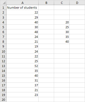
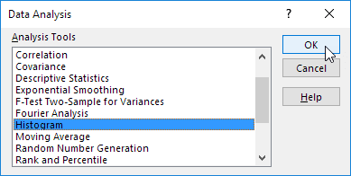
2. On the Data tab, in the Analysis group, click Data Analysis.

3. Select Histogram and click OK.
4. Select the range A2:A19.
5. Click in the Bin Range box and select the range C4:C8.
6. Click the Output Range option button, click in the Output Range box and select cell F3.
7. Check Chart Output.
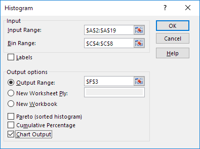
8. Click OK.

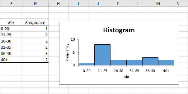
9. Click the legend on the right side and press Delete.
10. Properly label your bins.
11. To remove the space between the bars, right click a bar, click Format Data Series and change the Gap Width to 0%.
12. To add borders, right click a bar, click Format Data Series, click the Fill & Line icon, click Border and select a color.
Result:
If you have Excel 2016 or later, simply use the Histogram chart type.
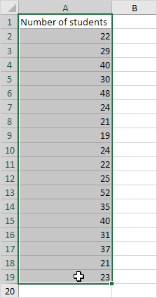
13. Select the range A1:A19.
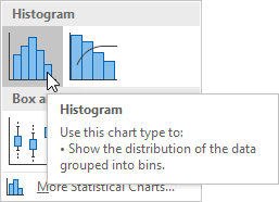
14. On the Insert tab, in the Charts group, click the Histogram symbol.

15. Click Histogram.
Result. A histogram with 3 bins.
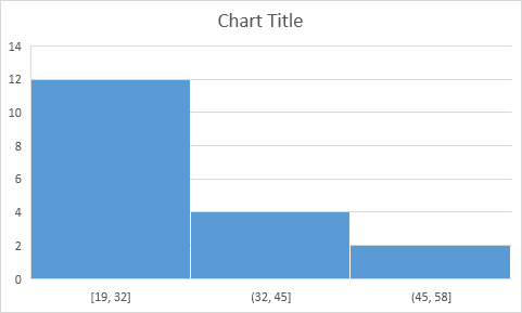
Note: Excel uses Scott's normal reference rule for calculating the number of bins and the bin width.
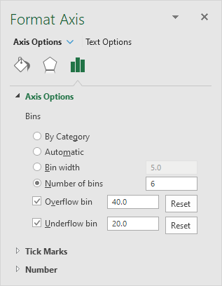
16. Right click the horizontal axis, and then click Format Axis.
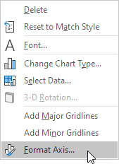
The Format Axis pane appears.
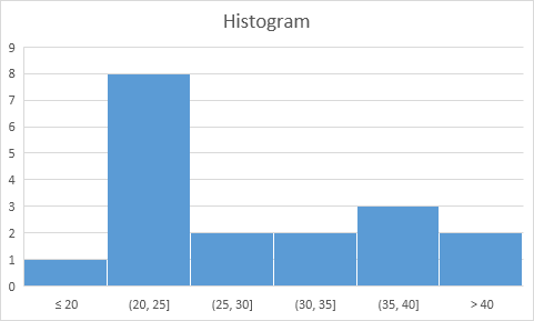
17. Define the histogram bins. We'll use the same bin numbers as before (see first picture on this page). Bin width: 5. Number of bins: 6. Overflow bin: 40. Underflow bin: 20.
Result:
If you have any query or want any help related to excel feel free to join our Telegram channel and message us..
Channel link :


2 Comments
Not only early but very helpful post
ReplyDeleteThank you😊
Delete